MANUAL
Forex Vitals Dashboard User Manual
Table of Contents
- 1. What the Dashboard Is
- 2. What You Can Click & Do
- 3. Dashboard Layout & Header
- 4. Card Anatomy (Visual)
- 5. Reading the Badges (News & Levels)
- 6. Signal Freshness
- 7. ATR & Daily Range
- 8. How We Score Pairs
- 9. Analysis Details (“The Why”)
- 10. Filters, Sorting & Watchlists
- 11. Charts, Levels & Copy-to-Clipboard
- 12. Alerts, Sessions & Market State
- 13. Putting It All Together
- 14. FAQ (Detailed)
1. What the Dashboard Is
The Forex Vitals Market Dashboard is a real-time tool that scans the major FX pairs and compresses a lot of information into a single Confidence Score per pair.
Behind each card you see on the Dashboard are four tools working together: Technicals, Fundamentals, Sentiment, and News. The system combines them into one score and labels each pair (e.g. STRONG BUY, SELL, etc.). Your job is not to stare at charts all day — it's to quickly identify where everything lines up.
This guide will walk you through:
- Every element of a Dashboard card and what it means.
- All of the actions you can take: charts, watchlists, filters, copying levels, and alerts.
- How to blend the Dashboard with your personal strategy without overtrading.
2. What You Can Click & Do (Quick Map)
If you only read one part of this guide, read this. Here's a quick map of everything that is interactive:
| Element | Where It Is | What It Does |
|---|---|---|
| Pair Header (e.g. EURUSD) | Top of each card | Click to open a full TradingView chart for that pair. |
| Star Icon (☆ / ★) | Left of the pair name | Click to add/remove the pair from your personal Watchlist (stored in your browser). |
| Score Matrix (TECH / FUND / SENT / NEWS) | Middle of each card | Click to open the Analysis Detail window for a plain-English breakdown of why the score is what it is. |
| Support / Resistance Levels | Near the bottom of each card | Click either box to copy that price to your clipboard for use in your trading platform. |
| Filter Chips | Below the header equalizer (“★ WATCHLIST”, “🔥 HOT”, BUY/SELL etc.) | Click to filter cards by signal strength or category. Chips are toggle-on / toggle-off and can stack. |
| Filter Input | Top right, “FILTER FEED…” | Type a symbol (e.g. “EURUSD”, “JPY”, “CAD”) to show only matching pairs. |
| SCORE / A-Z Buttons | Next to the filter input | Choose whether the dashboard sorts by strongest signals or alphabetically. |
| ENABLE ALERTS / ALERTS ON | Top right, next to “MANUAL” button | Click to turn desktop notifications on or off for signal and news events. |
| Empty-State Button “SHOW ALL PAIRS” | When filters hide everything | Click to clear filters and bring back the full grid. |
Everything else (colors, labels, timers) is informational and is explained in the sections below.
3. Dashboard Layout & Header
Before diving into a single card, it helps to understand the global parts of the Dashboard that sit above the grid.
A. Brand, Status & Logo
- MARKET DASHBOARD - The system name, shown next to the logo.
- Last Updated - A timestamp that flashes when new data arrives. When the market is closed, this flips to “MARKET CLOSED” and the site switches to a “closed” visual mode.
- Logo - Dynamically changes to highlight the strongest currency in the market (or a special “closed” logo when markets are shut).
B. Session Bar
Directly under the header you'll see session badges: SYDNEY · TOKYO · LONDON · NEW YORK.
- The sessions that are currently open are highlighted as active.
- On session holidays (e.g. bank holidays) the badge shows a special HOLIDAY treatment.
- This helps you quickly see where liquidity is coming from right now.
C. Market Volatility Meter
To the right of the sessions is the MARKET VOL meter. It averages the volatility across all tracked pairs and categorizes the day as:
- QUIET - Low movement; expect slower trades and less follow-through.
- NORMAL - Typical movement environment.
- HIGH - Volatility is elevated; ranges can extend and stops should be sized accordingly.
- SURGE - Very high volatility; market is “on fire” and prices can overshoot targets.
The meter shows both a text label and a filling bar. The bar animates in real time as volatility changes.
D. Controls: Guide, Alerts, Sort & Filter
- DASHBOARD GUIDE - Brings you back to this page.
-
ENABLE ALERTS / ALERTS ON - Toggles browser notifications for:
- Significant changes in signal level (e.g. from BUY → STRONG BUY).
- Important news or volatility events for a pair.
-
SCORE / A-Z - Sort mode:
- SCORE: Strongest positive or negative scores float to the top.
- A-Z: Pairs sorted alphabetically (easier when hunting for a specific symbol).
-
FILTER FEED… - Free-text search:
- Type part of a symbol:
eur,jpy,usd, etc. - Works together with filter chips and watchlists.
- Type part of a symbol:
E. Currency Strength Equalizer
Under the header you'll see vertical bars for each currency (USD, EUR, GBP, JPY, etc.). This is the Currency Strength Equalizer.
- The longer the bar, the stronger (or weaker) that currency is right now.
- Positive values (often green) indicate strength, negative values (often red) indicate weakness.
- Use this to match strong vs. weak currencies (e.g. buy a strong USD against a weak JPY), or to avoid trading two equally strong/weak currencies against each other.
4. Card Anatomy (Visual)
Every card on the dashboard represents a currency pair. Understanding this layout lets you scan opportunities in seconds.
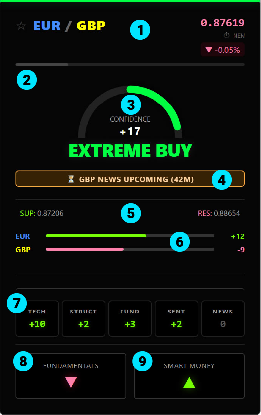
- Header & Watchlist Star - Shows the pair, star for Watchlist, live price, percentage change, and the Time in State timer.
- ATR/Daily Range Bar - Shows how much of today's typical range has already been used.
- Signal Label & Score - The high-level call (e.g. STRONG BUY) and the underlying numeric score.
- Status Badges - Alerts for Imminent News, Breakouts, Holidays, or Liquidity warnings.
- Key Levels - Today's Support & Resistance prices. Click to copy for quick order placement. Look for ♻️ icons indicating a recent Retest/Flip.
- Mini Strength Bars - Relative strength of the base and quote currencies versus the broader market.
- Score Matrix - Contribution from each tool (Technical/Fundamental etc). Click this area to open the details.
- Fundamentals Bias - Direction based on Interest Rate Differentials. A green arrow means the math favors holding the trade long-term.
- Smart Money Bias - Institutional positioning based on COT Data. Shows if Big Banks/Hedge Funds are Net Long (▲) or Net Short (▼).
5. Reading the Badges (News & Levels)
The Dashboard uses specific badges and icons to warn you of market conditions, data releases, or technical events.
A. News & Events
| ⏳ NEWS UPCOMING | High-impact news is 20-60 minutes away. Safe to trade, but be aware of the deadline. |
| 🚨 NEWS IMMINENT | High-impact news is less than 20 minutes away. DANGER ZONE. The system penalizes the score (50% reduction) to discourage entering during this volatile window. |
| 🚀 BULLISH NEWS | Recent data release was positive for the pair. (e.g., strong data for the Base currency or weak data for the Quote currency). |
| 🔻 BEARISH NEWS | Recent data release was negative for the pair. |
| ⚡ MIXED BUNDLE | Multiple events occurred simultaneously with conflicting results (e.g., strong GDP but weak Unemployment). Volatility is high, but direction is unclear. |
| 🎙️ SPEECH ONGOING | A central bank official is speaking. These events are unpredictable—prices may spike suddenly based on specific comments. |
| 🏖️ HOLIDAY | Bank holiday for one of the currencies. Expect lower liquidity and potentially erratic moves. |
B. Market Condition Badges
| 💤 LOW LIQUIDITY | Volume is significantly below average. Market may be dead or prone to spread widening. |
| 🌙 QUIET MARKET | Volume is normal to low. Trading conditions are stable but moves may lack follow-through. |
| ⚠️ HIGH VOLATILITY | The market is moving faster than normal. Use wider stops or reduced leverage. |
| ⚡ EXTREME VOL | Price is moving violently (3x normal speed). The system reduces confidence scores to prevent chasing spikes. |
C. Technical Structure
| 🚀 BREAKOUT UP | Price has just surged above a key resistance level. |
| 📉 BREAKOUT DOWN | Price has just dropped below a key support level. |
| ♻️ TESTING NEW SUP/RES | The "Flip" (Retest). A level that was previously broken is now being tested from the other side (e.g. old Resistance acting as new Support). These are often high-quality entry points. |
| 🧱 / 🛡️ TESTING | Standard test of an existing Resistance (Brick) or Support (Shield) level. |
6. Signal Freshness
The timer in the top right corner of each card shows Time in State — how long the current directional bias has been active.
- NEW - Signal just fired.
- 2h 15m - Signal has been valid for 2 hours and 15 minutes.
- --- - The pair is currently NEUTRAL (Score 0), so there is no active directional bias.
Use this to favor fresh moves rather than late entries into exhausted trends.
7. ATR & Daily Range
ATR (Average True Range) measures typical daily volatility. The Dashboard compares the current day's move to that typical range and shows how much of it is already “used up”.
- 0-70% - Plenty of room to move. The day is still developing.
- 70-90% - Caution. The daily move is maturing.
- 90-100%+ - High risk of exhaustion. Moves are statistically more likely to stall or reverse.
Hovering the bar will show the exact percentage of the daily range filled. When planning trades, prefer setups where the ATR bar is not already maxed out.
8. How We Score Pairs
The Dashboard Score ranges from -25 to +25. It is the sum of five analysis tools: Technicals, Structure, Fundamentals, Sentiment, and News.
A. Technicals (TECH)
Looks at trend (e.g. Moving Averages), momentum (e.g. RSI), structure, and price-action. It rewards alignment across timeframes and penalizes chop or reversal conditions.
B. Fundamentals (FUND)
Compares interest rates, central bank stance, and economic context between the two currencies. (e.g. if one currency offers a much higher rate, it tends to attract investment).
C. Sentiment (SENT)
Processes Smart Money Positioning data (like COT reports). It rewards alignment with major institutions. It rewards alignment with major institutions and penalizes extreme, crowded positioning that is likely to reverse.
D. News (NEWS)
The system calculates a "Net Score" by weighing recent Bullish events against Bearish ones. It is dynamic: in quiet markets, news impact fades quickly (20 mins), but during high volatility, the score remains active for longer (up to 5 hours).
Note: The total News Score is capped at ±4. This ensures that news events are significant but never completely overpower the Technical analysis.
E. Structure (STRUCT)
Analyzes the Market Structure across 5 timeframes. It rewards pairs that are trending (Higher Highs/Lower Lows) AND are currently bouncing off a key Fibonacci Level (buying the dip).
The signal label is derived from the final score:
- EXTREME BUY - Very strong bullish confluence.
- STRONG BUY - Strong bullish case.
- BUY - Mild to moderate bullish bias.
- NEUTRAL - No edge; factors cancel out.
- SELL / STRONG SELL / EXTREME SELL - Mirror image on the bearish side.
9. Analysis Details (“The Why”)
The Analysis Detail window tells you why a pair has the score it has. This keeps you from blindly following a label without understanding the drivers.
To open it, simply click on the score matrix (the TECH / FUND / SENT / NEWS grid) on any card.
The window shows:
- A short English summary of the situation (e.g. “USD is strong on news data while JPY remains weak”).
- A list of active factors such as “Bullish trend on H1 (+3)”, “Rate differential favors USD (+2)”, or “News Penalty active (-50%)”., etc. Positive contributions are highlighted in green, negatives in red.
Use this to confirm your trade idea or to decide if you want to pass because the drivers don't match your strategy (for example, when a move is purely news-driven and you prefer cleaner technical setups).
10. Filters, Sorting & Watchlists
A. Text Filter (“FILTER FEED…”)
- Type part of a symbol such as “eur”, “usd”, or “cad”.
- The grid will only show pairs whose symbol or name matches your text.
- Works together with signal filters and the Watchlist filter.
B. Sort Modes (SCORE vs A-Z)
- SCORE - Sorts by the absolute score. Biggest moves (positive or negative) float to the top.
- A-Z - Sorts pairs alphabetically. Useful when hunting for one specific pair.
C. Signal Filter Chips
Under the equalizer, you'll see chips like BUY, STRONG BUY, SELL, etc. Clicking a chip toggles that filter on/off.
- EXTREME BUY / STRONG BUY / BUY - Show only bullish signals of that strength.
- NEUTRAL - Show pairs where the system sees no clear edge.
- SELL / STRONG SELL / EXTREME SELL - Show only bearish signals.
- You can combine signal chips with the text filter. For example: filter by “JPY” and then tap STRONG SELL to see only JPY pairs with strong sell signals.
D. Special Filters: Watchlist & HOT
-
★ WATCHLIST - Shows only the pairs you have starred.
- Click the star icon (☆ / ★) on any card to add or remove it from your Watchlist.
- Watchlist membership is stored in your browser, so it stays there next time you visit.
- 🔥 HOT - Shows only “high-probability” signals, defined as pairs with absolute score ≥ 11 (STRONG BUY / STRONG SELL or stronger).
Filters stack logically. For example, you can:
- Turn on ★ WATCHLIST + 🔥 HOT to see only your best pairs with the biggest current edges.
- Search for “USD” and then tap BUY + STRONG BUY to see only bullish USD setups.
E. Empty States & “SHOW ALL PAIRS”
If your current filters hide every card, the Dashboard shows a friendly empty state instead of a blank grid:
- Your Watchlist is Empty - When using the Watchlist filter with no starred pairs.
- Market is Quiet - When “HOT” is enabled but no pairs meet the high score threshold.
- No Results Found - When the text search matches nothing.
- No Signals Found - When signal filters match no pairs.
In all cases, you'll see a “SHOW ALL PAIRS” button. Clicking this clears all filters and restores the full grid.
11. Charts, Levels & Copy-to-Clipboard
A. Opening the Chart
To open a full chart for a pair, simply click the card header (anywhere on the top bar with the pair name, except the star icon).
- A TradingView chart loads in a window with the correct symbol.
- You can change timeframes, add indicators, and use your usual TradingView tools.
- Close the chart by clicking the × in the top right or clicking outside the window.
B. Copying Key Levels
Near the middle of each card are two level boxes: SUPPORT and RESISTANCE. Click either box to copy that price to your clipboard.
Click either box and the price is copied to your clipboard. You won't see a popup, but you can immediately paste the value into your broker's order ticket or charting platform.
When levels are being tested or have recently broken, the card will show additional badges like “BREAKOUT UP” or “TESTING LEVEL” for extra context.
If you see a "Recycle" icon on a level (e.g. TESTING NEW SUPPORT), it means the price broke a level and is coming back to test it from the other side. This "Support-becomes-Resistance" (or vice versa) is a classic technical setup.
12. Alerts, Sessions & Market State
A. Desktop Alerts
Click the ENABLE ALERTS button in the header to turn alerts on. Your browser will ask for permission. Once enabled:
- The button switches to ALERTS ON with highlighted styling.
- The setting is saved locally so it is remembered next time you visit from the same device.
You will receive alerts when:
- A pair's signal level changes state (e.g. from BUY → STRONG BUY, or from SELL → EXTREME SELL).
- Important news or volatility flags appear for a pair.
Alerts are per pair and use a “tag” so newer alerts replace older ones instead of stacking endlessly. You can always turn them off by clicking the button again.
B. Trading Sessions & Holidays
The Dashboard continuously tracks whether the Forex market is considered OPEN or CLOSED based on New York time. When closed:
- The header shows “MARKET CLOSED”.
- Price updates and signals pause to avoid misleading data.
- The logo switches to a special “closed” variant.
On holidays, relevant sessions are flagged as such, and the Dashboard will usually tag affected pairs with “HOLIDAY” or “LOW LIQUIDITY” type badges to warn you about thin conditions.
C. Market Status
The Dashboard pauses when the New York session closes on Friday and resumes Sunday afternoon. It will clearly display “MARKET CLOSED” during this time.
13. Putting It All Together
The Dashboard is a decision support system, not an autotrader. A typical workflow might look like this:
Step 1: Identify Your Setup
Start with your own strategy. Maybe you trade pullbacks, breakouts, or reversals.
Wait for your chart to produce a candidate setup.
Example: Price is testing a daily support level on EURUSD on your charts.
Step 2: Check the Dashboard
Look up the pair in the Dashboard:
- Use the FILTER FEED… box to type “EURUSD”.
- Confirm the signal label (e.g. STRONG BUY) matches your directional idea.
- Check the Time in State so you know if the move is fresh or late.
- Glance at the ATR bar to ensure there is still room in the daily range.
Step 3: Open the Analysis Details
Click the score matrix to open the Analysis window. Confirm that the underlying factors line up with your rationale. Examples:
- Technicals and Fundamentals both bullish → higher confidence.
- Score driven only by News while Technicals are flat → maybe you avoid chasing.
Step 4: Check Levels & Volatility
- Check Support/Resistance boxes for obvious levels that overlap your chart's structure.
- Click a level to copy the price and paste into your broker ticket.
- Check the Market Vol meter and session badges to understand whether liquidity/volatility support your trade.
Step 5: Decide, Size, and Log
If everything aligns, execute according to your risk plan. If not, stand aside. You can star the pair to keep it in your Watchlist and wait for a better moment.
14. FAQ (Detailed)
Technical Questions
Q: What timeframes does the dashboard analyze?
A: The system primarily analyzes the H1 (Hourly) timeframe for active trade ideas, but it
references higher timeframes (such as D1) for trend context and lower timeframes for volatility spikes.
Q: How often does the data update?
A: The dashboard refreshes its core data approximately once per minute, while price quotes update in near
real-time. The “Last Updated” time flashes whenever a fresh snapshot is processed.
Q: Why did a “Strong Buy” suddenly disappear?
A: This usually happens because either:
1. News Impact: A high-impact release or unexpected event changed conditions, and the system
reduced or removed score points to avoid chasing risky moves.
2. Trend Violation: Price action moved against the previous bias (e.g. broke a key trendline
or structure level), which invalidated the prior technical case.
Features & Usage
Q: What does “Low Liquidity” mean?
A: The tag appears when trading volume is significantly below normal levels (often during holidays or off-hours).
In such environments, spreads can widen and false moves are more common. Treat these signals with extra caution
or consider standing aside.
Q: How do I create and use a Watchlist?
A: Click the star icon (☆) on any card to add it to your Watchlist (it will turn into ★).
Then click the “★ WATCHLIST” filter chip to show only those starred pairs.
Your Watchlist is saved in your browser, so it stays there for next time.
Q: What is Sentiment based on?
A: Sentiment primarily uses COT (Commitment of Traders) and similar positioning data to infer how
large players are positioned. It's best interpreted as a background bias rather than a short-term
entry signal by itself.
Q: Why are all scores 0 or “Neutral”?
A: This usually occurs on weekends or during extended closures when the FX market is effectively offline.
The Dashboard flattens scores and will repopulate them once the market reopens (typically Sunday evening, New York time).
Q: Do I have to trade every signal?
A: No. The Dashboard is designed to filter the market and show you where the best setups are,
but your personal strategy, risk plan, and discretion should always have the final say.